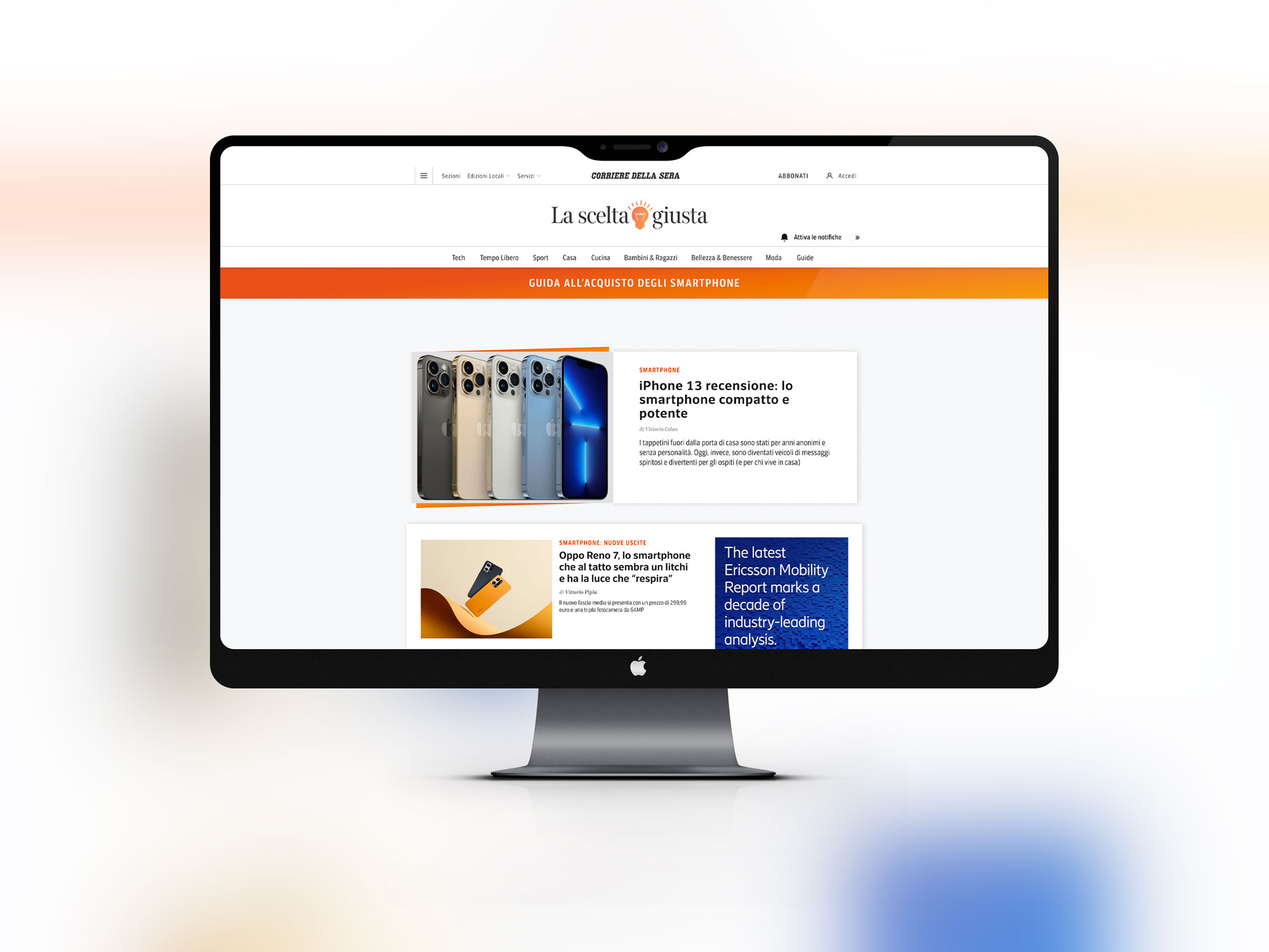
Designing a shopping advice platform is not child’s play: giving the right advice, offering independent reviews, gaining the trust of readers can be a tortuous and complex path. Daughter of LOGIN, La Scelta Giusta is Corriere della Sera’s selling-advisory platform dedicated to the world of technology and innovation.

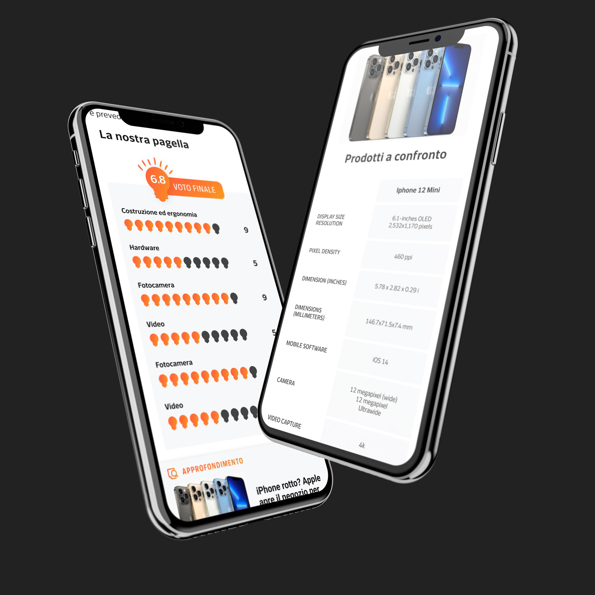
Being an emanation of the parent publication, from the point of view of the User Interface, Quibee has pursued the objective of defining a specific and recognizable brand identity, keeping this belonging to LOGIN alive and evident. Many graphic and visual elements which, on the user side, offer the possibility of perceiving the awareness of the advice offered by the editorial staff: comparison tables between products, report cards and votes on the very latest news from the world of technology, referral links to marketplaces on which to purchases at the most advantageous prices.
Also from the point of view of the User Experience, the main objective of the Quibee design team was to offer readers a series of analytical patterns capable of leading them into the complex world of new technologies, creating tools that would do justice to this complexity, but which also offered a sure rudder to navigate it with simplicity
La Scelta Giusta: what the platform is and what it does.
La Scelta Giusta is the Corriere della Sera selling-advisory project which offers products and services on which it writes reviews independently.
When readers buy through the links on the site, Corriere della Sera may receive a commission, but the final price for those who buy does not undergo any variation. Under each product review you will find links to purchase it.
La Scelta Giusta makes use of a comparator that for each product or service will propose, where possible, different sites where to buy them, sorting them in increasing order of price.


